
9/2/26
Sifting Through a Rebrand
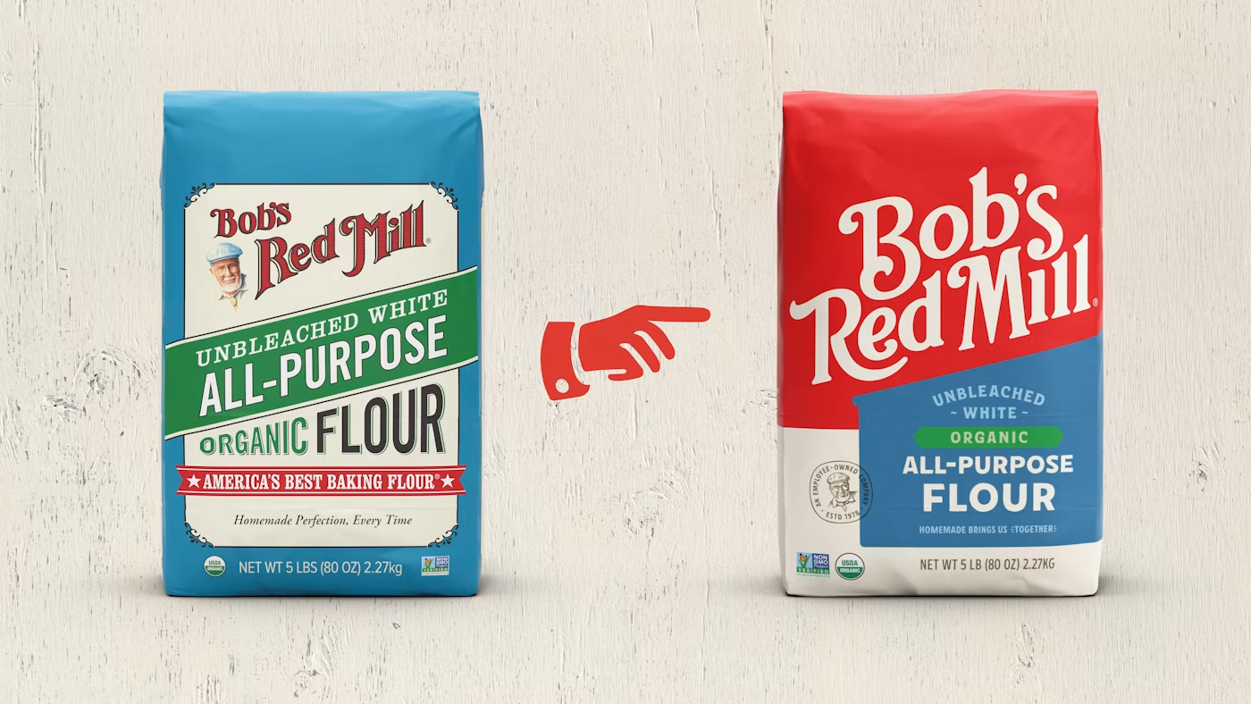
Bob’s Red Mill has long been known for its quirky, homemade-looking package designs—but no more. A fresh look has hit the shelves.
Looking at the old design, one would think this brand had been around since Abe Lincoln’s time. In reality, it only dates back to 1978, although this redesign is its first since the 1990s.
The new packaging takes some inspiration from the old, but it’s markedly different. The founder’s face is much less prominent. The custom typeface still gives an OG feel, but perhaps slightly less so than the previous font. The dietary call-outs (organic, gluten-free) pop a bit more.
A lot of research went into this, from eye-tracking (good) to focus groups (gag). According to that research, the new design drives purchase intent up by 15-20 percentage points. They could soon be raking in the dough (sorry).
The creative director at Bob’s says the design helps people identify the brand on shelf more easily and keep track of the various SKUs. That is probably correct. But I wonder if Bob’s has messed too much with a distinctive brand asset in the process.
We don’t know the details of how they approached their research, but an in-depth brand study aimed at understanding what makes Bob’s, Bob’s would have been an ideal first step. Was the old packaging an important asset or not? If so, what elements were most important?
It doesn’t appear that Bob’s has fumbled this as badly as Cracker Barrel did in its infamous attempt at modernization. The Bob’s fans on Reddit seem mixed in their reactions, although no one is threatening a boycott or trying to get the CMO fired. That’s probably a decent sign.
But has the brand lost some of its soul and uniqueness? I think it has. As one commenter said, it’s a visually pleasing design, but looks a little similar to Betty Crocker. What do you think?