A touching innovation
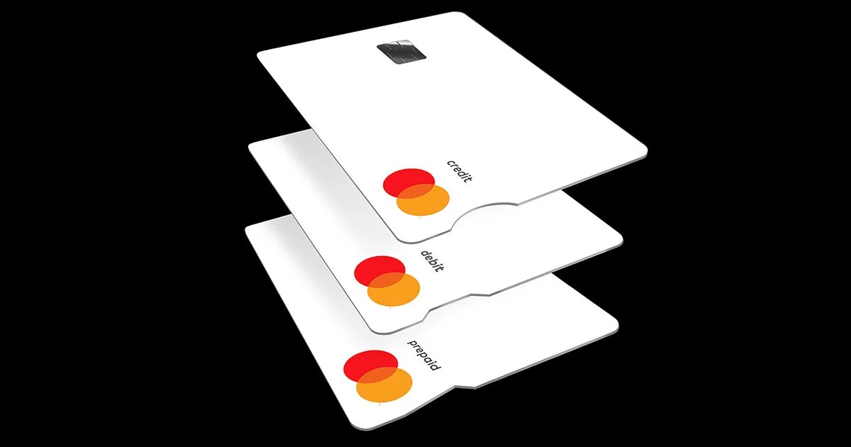
Mastercard has delivered an interesting mix of brand purpose and multi-sensory branding with its new Touch Card, designed for people who are blind or significantly visually impaired.
Mastercard has been a pioneer in sonic branding, rolling out a sonic brand identity in 2019, an effort that has been quite successful.
The brand also has stretched into areas like taste (with customized Mastercard macarons and branded restaurants) and smell (with a set of branded fragrances), which seem a little weird, but they certainly are bold, on-brand ideas.
Into that mix comes the Touch Card, which not only provides a sensory experience but also aligns with the brand’s commitment to inclusion.
In 2019, Mastercard created the True Name program, which enabled Trans and non-binary people to use a self-identified first name, which had long been a hang-up for financial service providers. The Touch Card broadens that inclusion with notches on the side of the card so that people can navigate their wallets by touch – a round notch for credit cards, a square notch for debit cards, and a triangular notch for prepaid cards. They are manufactured to work with all existing ATMs and payment terminals.
As we discussed in a Z-Files a couple of weeks ago, the benefits of brand purpose campaigns can be nebulous, at best, but this is one effort where purpose and profit seem to intersect nicely for Mastercard.

