A thing of beauty
Creative packaging can make a brand stand out both on shelf and in communication. Ben Van Leeuwen, founder of Van Leeuwen Artisan Ice Cream, discusses his brand’s packaging and other business issues in ad Adweek interview.
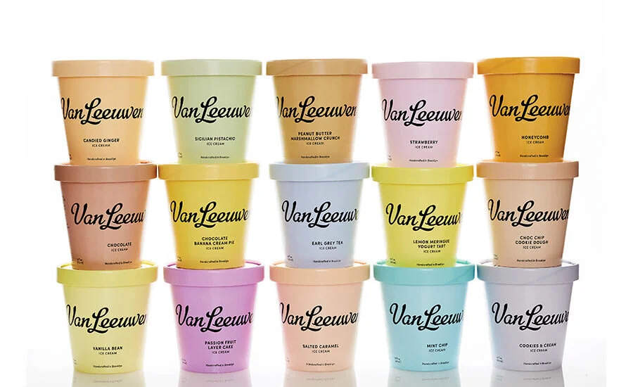
The packaging stands out on shelf in a number of ways. First, it is very clean compared to other ice cream brands. The pastel colors pop on shelf. The logo, inspired by the Coca-Cola script, gives this relatively new brand an old-school, neighborly, premium feel. And the design creates a clear visual distinction between the brands two lines, regular and vegan (the regular line uses black font on pastel, vegan products employ pastel font on white, while special limited-time holiday flavors use white font on a darker-color background)
It looks great on Instagram, too.
Sales of the brand increased by 50% within six months of the package redesign. There were probably other factors involved but the packaging certainly played a role. As Ben Van Leeuwen says, the packaging tells a story about both the brand and the taste experience consumers will enjoy.

