If it looks like a duck and quacks like a duck…
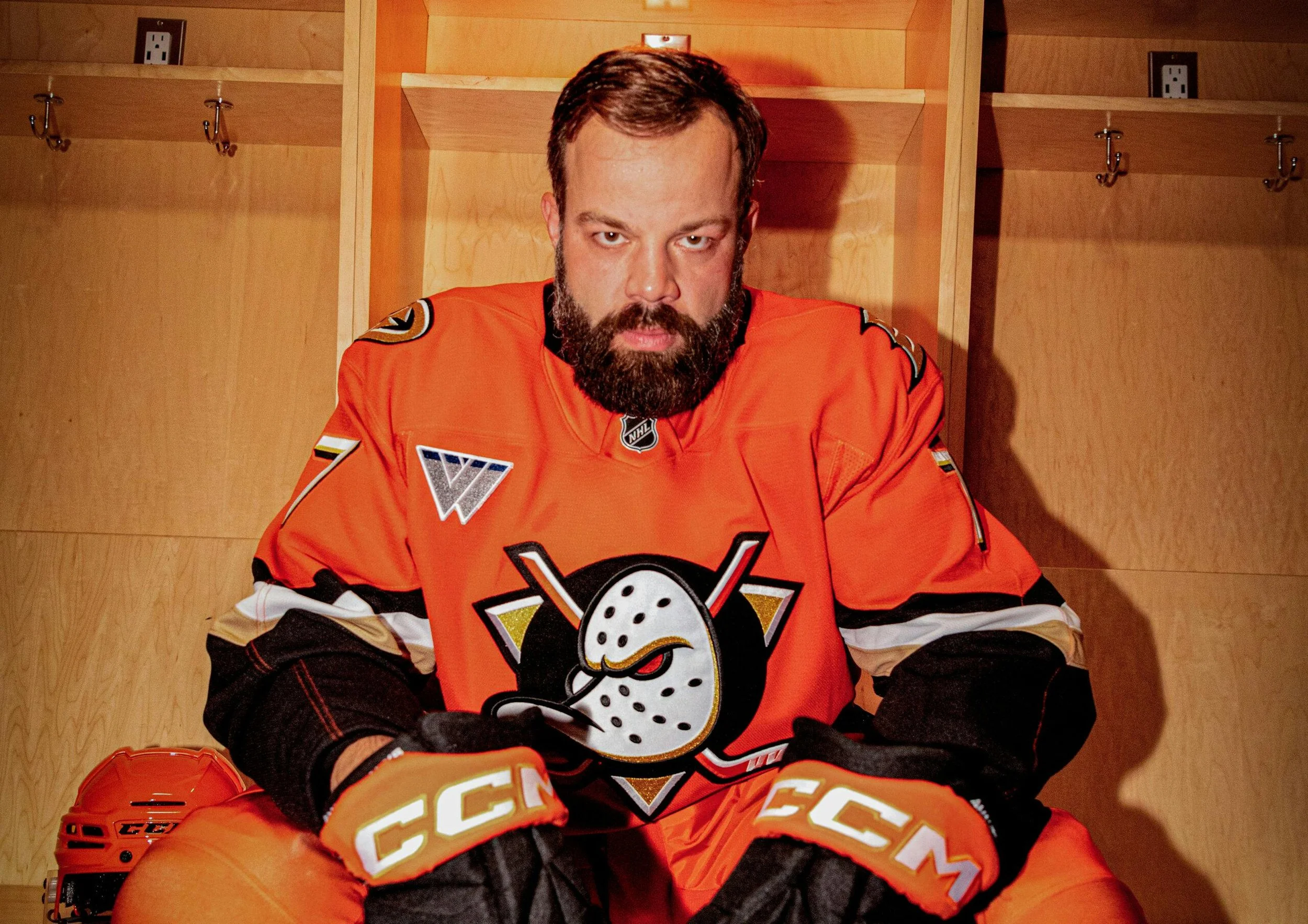
Photo: Anaheim Ducks
Ad Age discusses the branding evolution of the Anaheim Ducks hockey team.
Disney owned the Ducks for years, beginning with their founding in 1993. During that time the team logo was a cartoonish duck head shaped like a goalie mask. In 2006, the new owners got rid of the duck in favor of a more antiseptic design that resembled many other team logos. But now the duck is back, albeit in a slightly more menacing form than the original.
Along with the duck have come brightly-colored orange uniforms, a nod toward the team’s Orange County, California, home.
This is all very distinctive. Not many sports teams are adorned head-to-toe in bright orange with cartoon waterfowl faces. But going against the grain seems to be working because fans love it.
The uniform is accompanied by a distinctive brand voice that is cheeky and faux-menacing, much like the duck itself. (One of its videos is a retro-looking “ad” selling the teeth of opponents that the Ducks supposedly jarred loose during fights and hard hits.)
It is an example of a brand going back to its roots, while still keeping an eye on the future and younger generations of fans.
(The National Hockey League, incidentally, was Ad Age’s 2024 Marketer of the Year. They have grown their fan base by successfully connecting with Gen Z fans, who generally have fallen away from traditional team sports fandom. Anaheim’s rebrand seems to fit.)