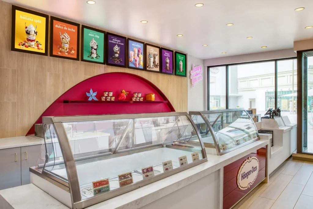
The scoop on a new store design
Although online shopping has taken over retail in many ways, brick-and-mortar is still huge – projected to account for 72 percent of all sales in 2024. Moreover, brick-and-mortar provides an opportunity for the kind of brand experience that isn’t possible online.
Häagen-Dazs has 208 franchised store locations and they recently revamped those stores in a way that reinforces the brand’s luxurious image. They had to do it on the quick and cheap because franchisees don’t typically have deep pockets, but they think they pulled it off.
Adweek discusses how each of six of key elements of the new store design create a premium brand experience for consumers. For example:
They replaced a black, white, and gold (which reflected a more dated vision of luxury) with woodgrain.
They have artistic touches, like a shelf that spans a long cove behind the counter and features ice cream containers and other decorations displayed in a careful, artistic manner.
The menu boards are brightly color-coded, which creates a feeling of indulgence.
It is always fascinating how subtle cues, which consumers may only notice in the periphery of their minds, can work together to create an emotionally meaningful experience. What do you think of Häagen-Dazs’s design choices?

