Too much information?
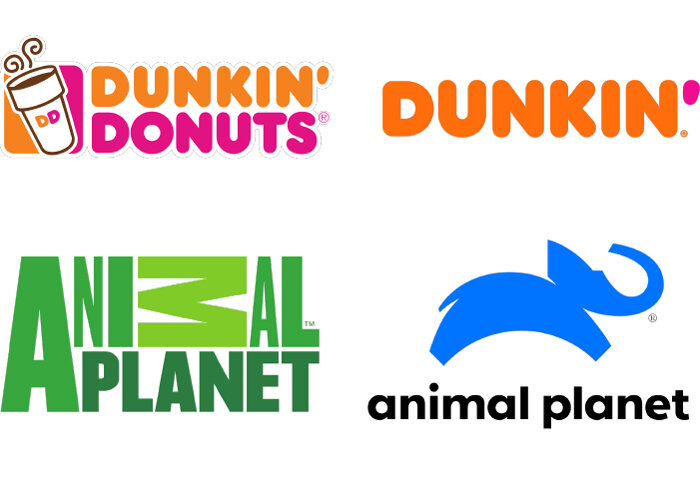
What do you think of the logo changes above? All else being equal, which of the changes is more effective?
A study in the Journal of Marketing Research explored the difference between descriptive and non-descriptive logos. A descriptive logo “includes text or visual design elements that clearly communicate the type of product or service a brand is marketing.” For example:
Burger King’s logo is descriptive because it sells burgers and its logo contains the word “burger” and a stylized image of a burger. The McDonald’s logo lacks these elements, and thus is non-descriptive.
In general, descriptive logos are more effective. They make brands seem more authentic, increase purchase intent, more positively affect brand perception, and boost net sales.
The exceptions to the rule, however, are just as interesting. The more familiar people are with your brand, the less the logo matters. So, McDonald’s probably shouldn’t change its logo to incorporate a Shamrock Shake. In fact, brand loyalists form strong emotional attachments to logos, even non-descriptive ones, so when you change them you disrupt people’s memories of the brand, which can backfire, at least in the short run.
Also, if your product brings to mind negative concepts, a non-descriptive logo tends to work better. In other words, if you are an exterminator, you may want to avoid images of mousetraps or dead moles in your logo. Being too descriptive will remind people of the bad things you help with and that can have a negative halo effect on your brand.
The authors also hypothesize that non-descriptive logos are better for companies that don’t want to be too closely associated with one product or service. So, Dunkin may have been wise to make its new logo non-descriptive because of its desire to be associated with all things breakfast, not just donuts and coffee.


