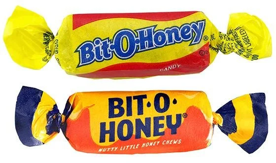
An un-bee-lievable change
Credit: MediaPost
Thanks to Jerry Olson for sharing this article about how a change in packaging and iconography reversed the fortunes of a moribund candy brand, Bit-O-Honey.
Spangler Candy acquired the nearly century-old Bit-O-Honey brand in 2020 because they thought it was undervalued. Its potential rested in the fact that the Bit-O-Honey recipe and taste are unique – it contains honey, almonds, and milk. Therefore, Spangler has been careful to replicate that flavor profile perfectly.
The new packaging is a perfect complement to the taste experience:
Spangler has changed the yellow on the packaging from a lemon yellow to more of a honey gold -- and expanded the gold so that it covers most the package.
They have added an image of dripping honey in the corner
They have enlarged Bit-O-Honey’s classic bee icon and made it look less cartoonish and juvenile and more like a real bee – especially important since this candy is mostly consumed by adults.
They have even made the packaging softer, to mirror the softness of the candy itself.
The new packaging came out in the spring and already the brand is seeing significant sales growth, which Spangler’s VP of Marketing, Evan Brock, attributes mostly to this change in package design. It is a great example of how packaging cues can change the perception of a brand and even, as the article suggests, enhance the taste experience.

